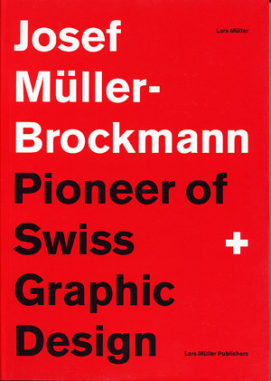
All of my designer readers most likely carry on a rather intimate relationship with Josef Müller-Brockmann. But, for those of you who aren’t so lucky, allow me to make the necessary introductions. Born in Rapperswil, Switzerland in 1914, Müller-Brockmann would later go on to become known as the Pioneer of Swiss Graphic Design. As explained in Eye Magazine:
By the 1950s [Müller-Brockmann] was established as the leading practitioner and theorist of the Swiss Style, which sought a universal graphic expression through a grid-based design purged of extraneous illustration and subjective feeling.
JM-B did an interview with Eye Magazine for their Winter 1995 issue, just one year prior to his passing. In the interview, the innovative Swiss designer was asked what order meant to him:
Order was always wishful thinking for me. For 60 years I have produced disorder in files, correspondence and books. In my work, however, I have always aspired to a distinct arrangement of typographic and pictorial elements, the clear identification of priorities. The formal organisation of the surface by means of the grid, a knowledge of the rules that govern legibility (line length, word and letter spacing and so on) and the meaningful use of colour are among the tools a designer must master in order to complete his or her task in a rational and economic manner.
The grid, the prioritization and arrangement of typographic and pictorial elements, the meaningful use of color… Observe the Swiss mastery below:
 { Source }
{ Source }
{ Source }
{ Source }
{ Source }
{ Source }
{ Source }
{ Source }
{ Source }
{ Source }


 s usual, I’m a little slow. Thus, my recent discovery (“recent” as in “5 minutes ago”) of


 oving these vintage Portuguese transportation ads — particularly the awesome lettering, which I found over at


 t’s finally snowing in Boston. It was 70 degrees here on Thursday. Very anti-Decemberish. So, I’m extremely excited to see the white fluff whisping around outside and even sticking on the ground. I’m about to go celebrate with a fresh mug of hot chocolate and mini-marshmallows. But first, I want to share some fun Swedish finds with you… they’ll keep you happy and warm this Saturday evening, whether yours is snowy or not. 🙂


