I’VE MOVED! PLEASE UPDATE YOUR RSS FEED!

My dear lovely readers,

***I’VE MOVED!***

My blog migration is complete: I have officially moved Words and Eggs over to Squarespace. Click HERE to check out my new cozy home! I’m prety psyched about it. You can find all of my previous posts over at my new blog, along with some recent posts from the past week, including a collection of vintage book graphics and Form magazine covers from the 1950s to the present day.

Sometimes I just want to bathe in vintage covers.
Is that TMI?

Anyway, for all you subscribers, please be so kind as to update your RSS feed for my new blog location:
http://wordsandeggs.squarespace.com

And please Please PLEASE feel free to leave me any and all feedback you might have on my new website, which is still somewhat of a work in progress. I’m still updating my links, so please don’t fret if you were linked on this blog but you no longer see yourself mentioned on my new blog (I’m talking to you, handmade artists and awesome shopkeepers).

Also, one of the new features on my new blog is that I’ll be seeking sponsorship. If you are interested in sponsoring and/or advertising your site, services, or shop on my site, please contact me for stats and rate info:
wordseggs [at] gmail [dot] com

I look forward to seeing you all over at my new home!

Best,
Lesley

Julian Montague’s Daily Book Graphics

Dear readers,

I am in the process of migrating over to Squarespace, where I just launched my first full-length post (I had been tinkering with a couple brief posts prior to this one, feeling out the site). My first full-length Squarespace post is devoted to the Daily Book Graphics project of artist/designer Julian Montague, which features a ton of amazingly drool-worthy vintage book images.

You can check out my post and Montague’s lovely book designs by clicking on the screenshot above.

I would also love any and all feedback on layout, design, content, etc.!

Best,

Lesley

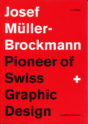
Josef Müller-Brockmann: Pioneer of Swiss graphic design.

All of my designer readers most likely carry on a rather intimate relationship with Josef Müller-Brockmann. But, for those of you who aren’t so lucky, allow me to make the necessary introductions. Born in Rapperswil, Switzerland in 1914, Müller-Brockmann would later go on to become known as the Pioneer of Swiss Graphic Design. As explained in Eye Magazine:

By the 1950s [Müller-Brockmann] was established as the leading practitioner and theorist of the Swiss Style, which sought a universal graphic expression through a grid-based design purged of extraneous illustration and subjective feeling.

JM-B did an interview with Eye Magazine for their Winter 1995 issue,  just one year prior to his passing. In the interview, the innovative Swiss designer was asked what order meant to him:

Order was always wishful thinking for me. For 60 years I have produced disorder in files, correspondence and books. In my work, however, I have always aspired to a distinct arrangement of typographic and pictorial elements, the clear identification of priorities. The formal organisation of the surface by means of the grid, a knowledge of the rules that govern legibility (line length, word and letter spacing and so on) and the meaningful use of colour are among the tools a designer must master in order to complete his or her task in a rational and economic manner.

The grid, the prioritization and arrangement of typographic and pictorial elements, the meaningful use of color… Observe the Swiss mastery below:

{ Source }

{ Source }

{ Source }

{ Source }

{ Source }

{ Source }

{ Source }

{ Source }

{ Source }

Source }

From Poe to Parker.

In my course, we’re transitioning. From one fractured poet to another, we’re transitioning.

From Poe to Parker.

So, I thought I’d present you with an imagistic representation of this literary trajectory.

{ Source }

{ Source }

{ Source }

{ Source }

{ Source }

{ Source }

{ Source }

{ Source }

{ Source }

{ Source }

{ Source }

{ Source }

{ Source }

{ Source }

On my summer reading list:

{ Source }

Peter Ackroyd is somewhat of a kindred spirit, frequently publishing wonderful material on tortured poets, even novels (Ackroyd’s Chatterton, for example, which I strongly recommend to anyone even remotely interested in the British Romantics).

Work it.

I‘m a bit tardy for the free calendar party: I meant to post pics a while ago of this ridiculously fabulous letterpressed calendar that Cranky Pressman sent me (for free, might I add. Fabulous Twitter offers, I love thee). The calendar was designed by Northcoast Zeitgeist and printed by Cranky Pressman, a union that makes me feel quite warm and fuzzy all over because they’re both Ohio-based. And, well, so am I. Or, at least, I was until about 9 years ago. One love, Ohio and your wonderful designers and letterpressers.

So, here it is, in all its letterpressed, retro-illustrated glory. And how appropriate that it’s emblazoned with the imperative, “WORK!”. Because that’s precisely what I need to do. Stupid dissertation.

Cranky Pressman is Keith & Jamie Berger. And they are lovely, albeit cranky. Oh, and they included a promotional letterpressed postcard and some other businesscard samples of their services with the calendar. Hopefully you can’t see the drool that seeped from my awe-struck mouth in the pictures below.

Awesome, right?

So, you should really check out both Cranky Pressman and Northcoast Zeitgeist. I’m really tempted by the possibility of having CP letterpress some of my hand-lettered/drawn stuff. And to release about 5 more gallons of drool.

I know, I’m not very lady-like.

Follow Cranky Pressman on Twitter HERE and visit their site HERE. Even their social media links look letterpressed. Jesus.

Follow Northcoast Zeitgeist on Twitter HERE and visit their site HERE.

The Taxali 300

Why don’t I live in Toronto? Or, at least, only an hour away or something? Because in Toronto there’s a place called Narwhal Art Projects. And at Narwhal Art Projects there’s an exhibition called The Taxali 300. And the Taxali 300 runs for a month, from January 28 – February 28, and it features hundreds (umm, 300?) of Taxali’s amazing illustrations and collages, together in a collection for the first time. From Narwhal’s website:

The Taxali 300 showcases hundreds of small illustrations and collages originally created for such esteemed publica- tions as Rolling Stone, Newsweek, The New York Times, GQ and McSweeneys among others. Spanning two decades and multiple awards and accolades, The Taxali 300 presents Gary’s exceptional collection of commercial illustration as a complete body of work in a gallery setting for the first time, allowing viewers to appreciate the prolific scope of visual communications and tactile character design intrinsically associated with Gary Taxali’s artwork.

It was painfully difficult to select only a handful to share with you here, so I really hope you’ll go to Narwhal’s gallery and look through them all yourselves. But here are some of my favorites. Emphasis on “some” – I have about a bajillion.


OK, I need to stop. I could post them all. Seriously.

Hope you like.

The Cornell Widow

was just gazing at some of the tons of brilliantly beautiful ephemera images over at Ephemera Assemblyman, and I thought I’d post some covers of a Cornellian student-run magazine called The Widow. It enjoyed over six decades of publication (1894-1962) until it was forced to go out of print because of yucky financial problems (ain’t that always the case?). As the Ephemera Assemblyman quotes on his site, The Widow’s name derives from “the college widow,” which was the name co-eds used to ascribe to “the girl who bowled over class after class of freshmen without really landing one.” Lovely. As you might imagine, the contents and images of the magazine could occasionally trend toward the misogynistic. But oh how the designs were lovely. Take a peek…

(All images below courtesy of the Ephemera Assemblyman)

That last cover was for an issue that appeared in 1981 (yes, 19 years after The Widow had actually folded) and was meant to mock the 100-year anthology of The Widow‘s rival, The Cornell Daily Sun).

For more covers as well as some interior content, head over to the Ephemera Assemblyman HERE.

(Initial “I” from HERE)

Vintage Rye.

Found: A collection of Catcher in the Rye covers in a variety of languages, from HERE. Oh, J.D…. R.I.P.

Some favorites: